Generate a professional Monthly Finance Review presentation with data-driven slides, charts, and corporate branding — all from CSV data.
27 minutes
What You'll Create
📋 Title slide matching your corporate template style
📈 KPI dashboard with key financial metrics
📊 Revenue and transaction volume charts
🗂️ Regional breakdown (Singapore, Malaysia, Indonesia, Thailand, Vietnam, Philippines)
🎯 Goals and strategic outlook
🎨 Consistent styling extracted from template screenshots
Template Slides
Kiro will analyze these 5 template screenshots to extract the brand style (colors, fonts, layout) and generate a presentation that matches:
Title
Section
KPI
Content
Closing
Step
Duration
Description
Save Templates & Create Data
5 min
Save template screenshots and generate KPI data
Analyze Style & Build Script
5 min
Let Kiro extract the brand style and create the generator
Generate Full Presentation
12 min
Create all slides, charts, and export the final PPTX
Review & Iterate
5 min
Open the PPTX, describe what to fix, and let Kiro refine it
Step 1: Save Templates & Create Data
First, save the 5 template slide images above to a monthly-review/template folder. Right-click each image and save as:
template_title.png
template_section.png
template_kpi.png
template_content.png
template_closing.png
Then in the Kiro chat panel, start a New Session in Vibe mode and paste:
PROMPT — Copy & paste into Kiro
I have 5 template slide screenshots in the monthly-review/template folder (template_title.png, template_section.png, template_kpi.png, template_content.png, template_closing.png).
Please:
1. Look at each template screenshot and extract the visual style: colors, fonts, layout, spacing, and design patterns
2. Create a file called monthly_kpis.csv in the monthly-review folder with 6 months of AnyCompany Finance KPI data (Jan 2025 - Jun 2025):
Columns: month, total_revenue_sgd, transaction_volume, active_merchants, wallet_txns, credit_card_txns, bnpl_txns, fraud_rate_pct, avg_settlement_hours, customer_satisfaction_score, new_merchant_signups, chargeback_rate_pct
Make the data show a growth trend:
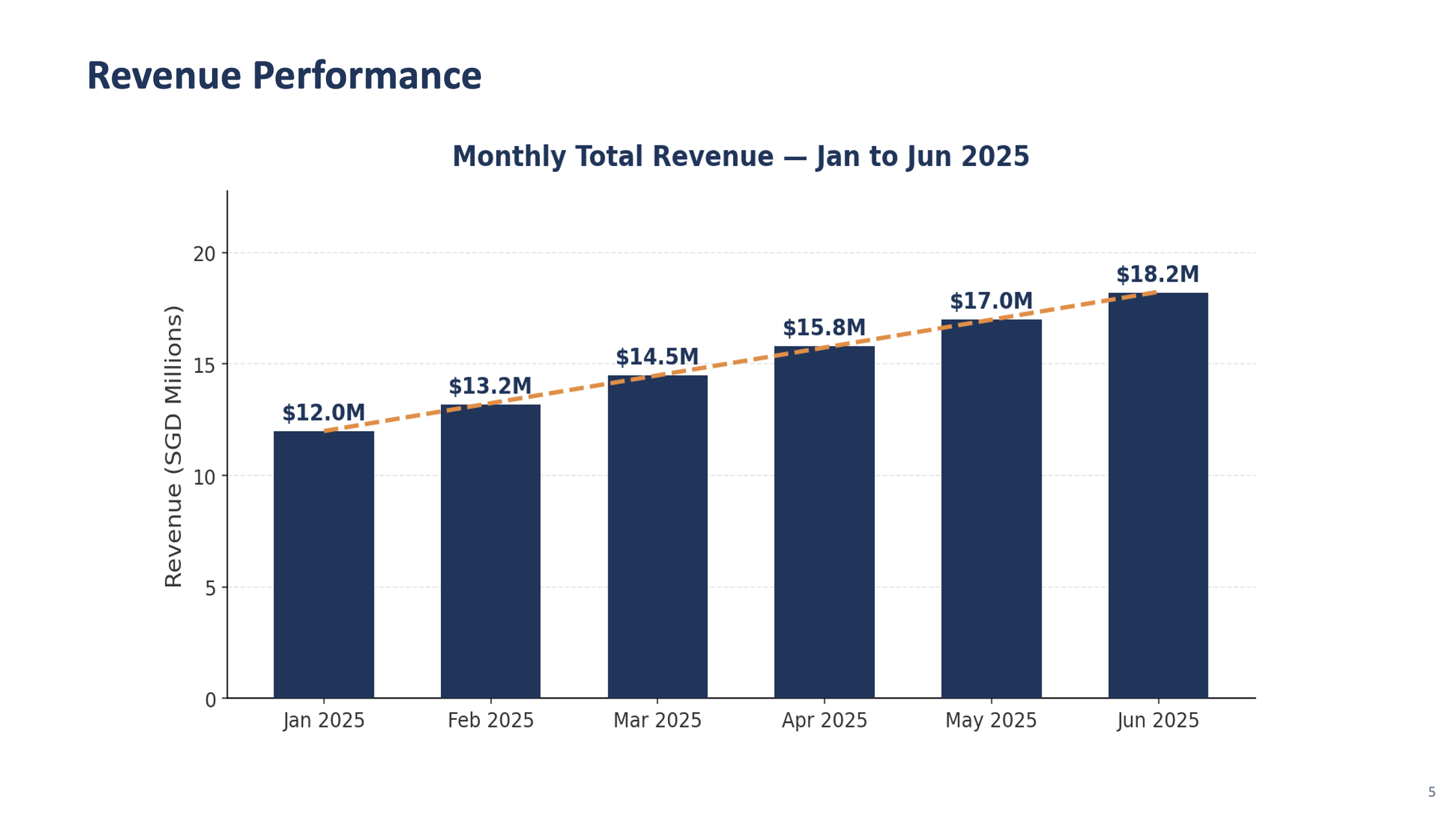
- Revenue growing from $12M to $18M SGD
- Transaction volume growing from 2.1M to 3.2M
- Fraud rate decreasing from 0.8% to 0.4%
- Customer satisfaction improving from 4.1 to 4.6
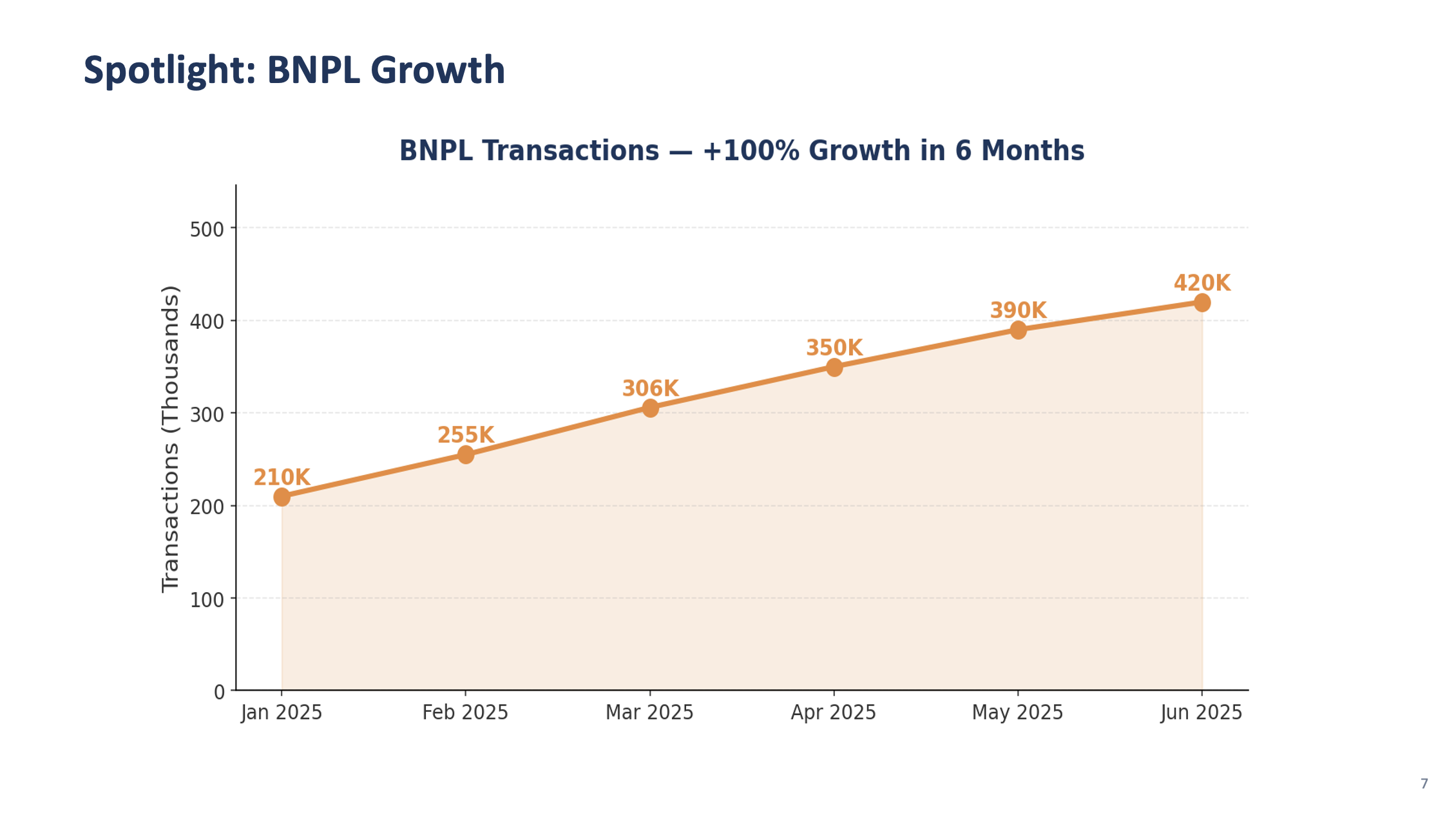
- BNPL transactions growing fastest (40% growth over 6 months)
3. Create a file called regional_breakdown.csv with columns: region, revenue_sgd, transaction_count, active_merchants, growth_rate_pct
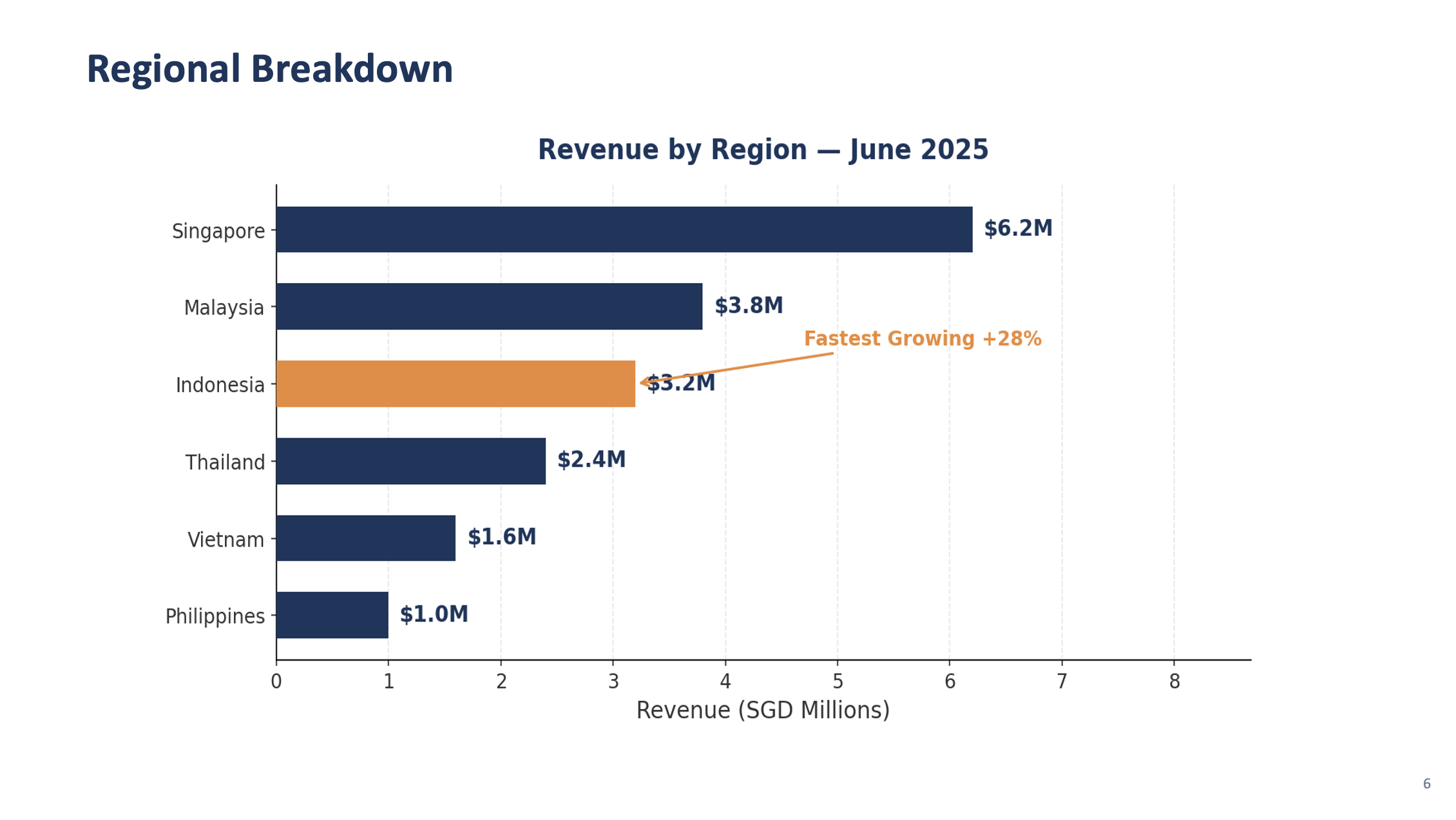
For: Singapore, Malaysia, Indonesia, Thailand, Vietnam, Philippines
Singapore should be the largest market, Indonesia the fastest growing.
4. Give me a summary of:
- The brand style you identified (colors, fonts, layout patterns)
- The slide types available based on the templates
- Key trends in the KPI data
✅ Checkpoint: Brand style extracted from screenshots · monthly_kpis.csv with 6 months of data · regional_breakdown.csv with 6 markets · Kiro's style and trend analysis
Step 2: Analyze Style & Build the Generator Script
In the same chat session, paste:
PROMPT — Copy & paste into Kiro
You are the CFO's Executive Assistant preparing the Monthly Finance Review for the leadership team. You know what executives care about: clear KPIs, trend direction, and actionable insights. The presentation must be polished and on-brand.
Based on the style you extracted from the 5 template screenshots, create:
1. A template_config.json file in the monthly-review folder that defines the brand settings you identified:
- Colors (background, accent, text, headings) extracted from the templates
- Font choices that match the template style
- Slide layouts for each template type: title, section_divider, kpi_dashboard, content, closing
- Company name: "AnyCompany Financial Group"
- Presentation title: "Monthly Finance Review — June 2025"
2. A Python script called generate_review.py in the monthly-review folder that:
- Reads template_config.json for brand settings
- Reads monthly_kpis.csv and regional_breakdown.csv using pandas
- Creates a 16:9 widescreen PowerPoint using python-pptx
- Creates a title slide matching the template_title.png style
- Creates a section divider slide matching the template_section.png style
- Saves as "review_test.pptx" with just the title and one section slide
Install python-pptx, pandas, matplotlib automatically. Run the script.
Open review_test.pptx and verify the slides match the template screenshots.
✅ Checkpoint: template_config.json generated from screenshot analysis · generate_review.py created · Test presentation matches template style
💡 Iterating on the design
PowerPoint generation with python-pptx can sometimes produce layouts that aren't pixel-perfect on the first try — text might overlap, fonts may look slightly different, or spacing could be off. This is normal and actually a great learning moment:
Open the generated PPTX and look at what needs adjusting
Describe the issue to Kiro in plain English: "The title text is too small", "Move the chart to the right", "The KPI cards are overlapping — add more spacing"
Kiro will update the code and regenerate — this back-and-forth is how real development works
Each iteration gets closer to the template. 2-3 rounds of feedback usually gets it right.
This iterative approach is one of the most powerful aspects of working with AI — you don't need to get the prompt perfect the first time.
Step 3: Generate the Full Presentation
In the same chat session, paste each prompt sequentially. Kiro will create slides that match the template style it extracted:
KPI Dashboard Slide
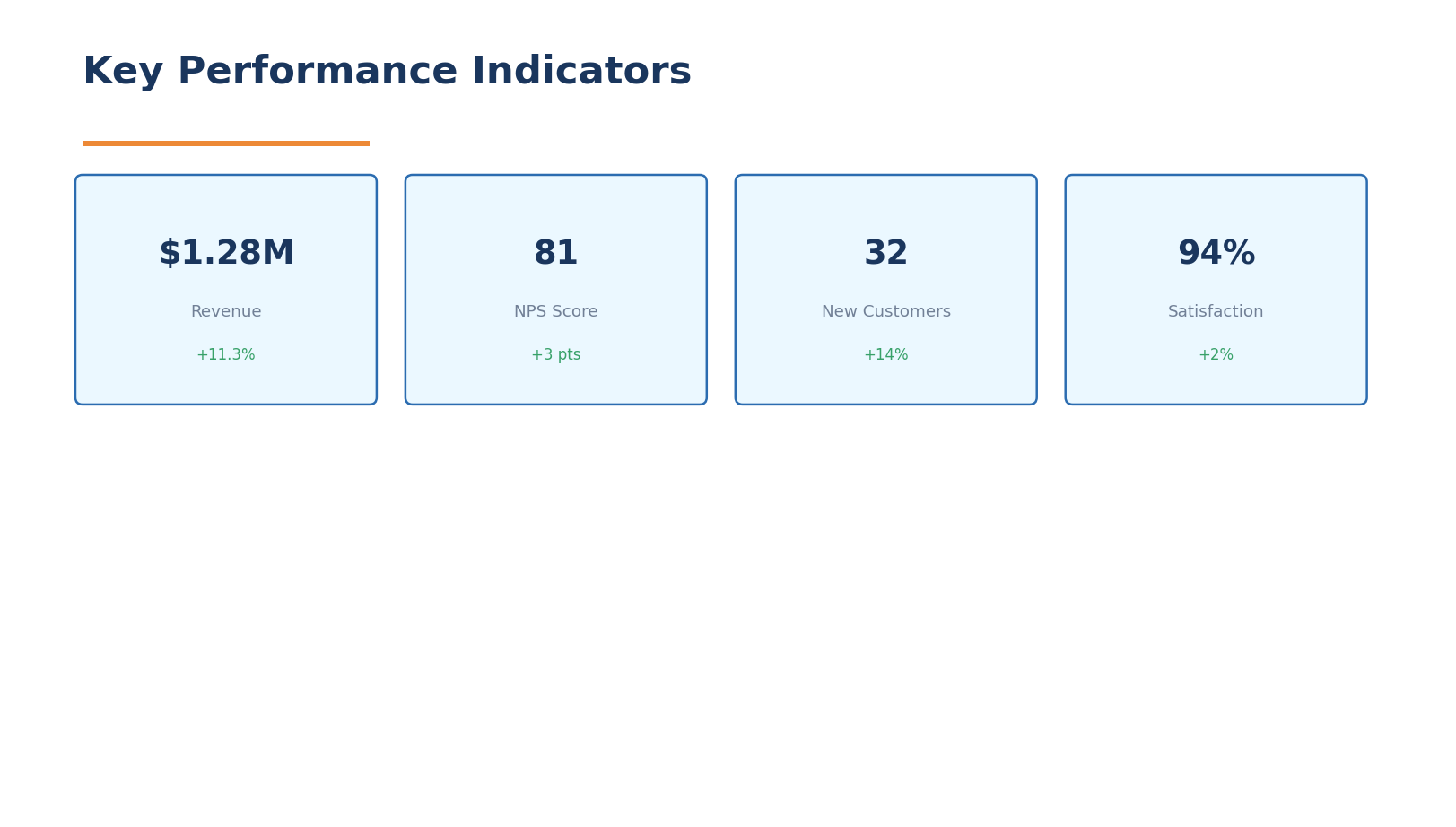
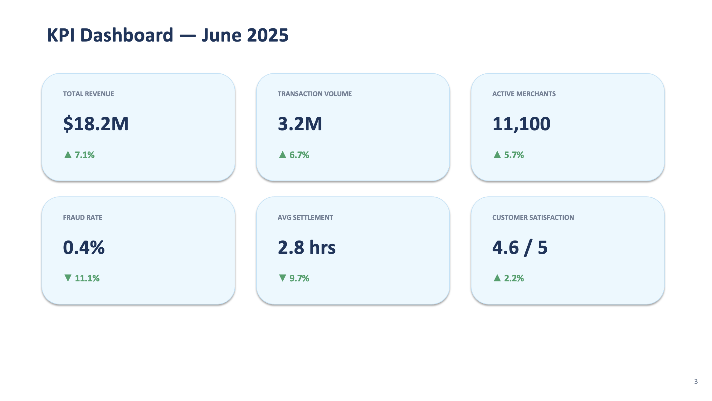
PROMPT 3a — KPI Dashboard
Add a function create_kpi_dashboard(df) that creates a KPI dashboard slide matching the template_kpi.png style. Show the latest month's metrics in a grid of 6 cards:
- Total Revenue: $18.2M SGD (with month-over-month change %)
- Transaction Volume: 3.2M (with change %)
- Active Merchants: count with change %
- Fraud Rate: 0.4% (green, showing improvement)
- Avg Settlement: hours with change
- Customer Satisfaction: score out of 5
Each card should have the metric name, value, and a green up-arrow or red down-arrow for the trend. Use the brand colors from template_config.json.
Chart Slides
PROMPT 3b — Charts
Add two chart functions that create content slides matching the template_content.png style:
1. create_revenue_chart(df) — Bar chart of Total Revenue by month using matplotlib. Use the brand colors from the template. Show growth trend line overlay.
2. create_regional_chart(df) — Horizontal bar chart showing revenue by region, sorted largest to smallest. Highlight Indonesia with a different shade and annotate "Fastest Growing +28%"
Save charts as temporary PNGs and embed them in the slides.
Analysis and Outlook Slides
PROMPT 3c — Analysis & Outlook
Add three more functions using the template styles:
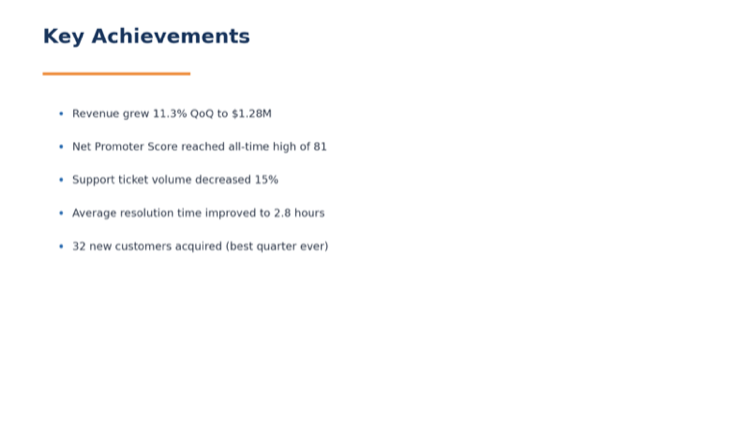
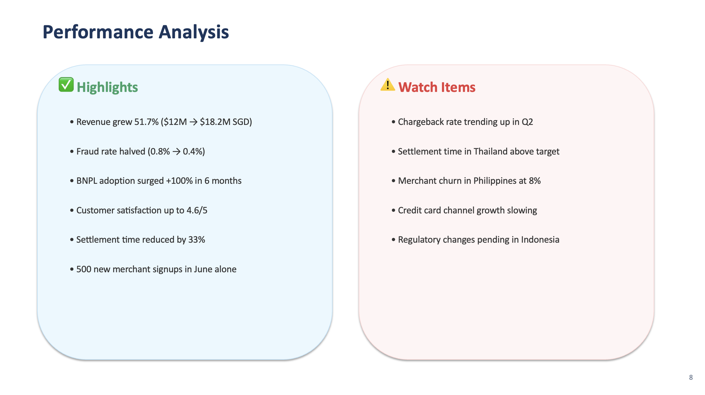
1. create_performance_analysis(df) — Two-column content slide: "Highlights" on the left (revenue growth, fraud reduction, BNPL adoption) and "Watch Items" on the right (chargeback rate trend, settlement time in Thailand, merchant churn in Philippines)
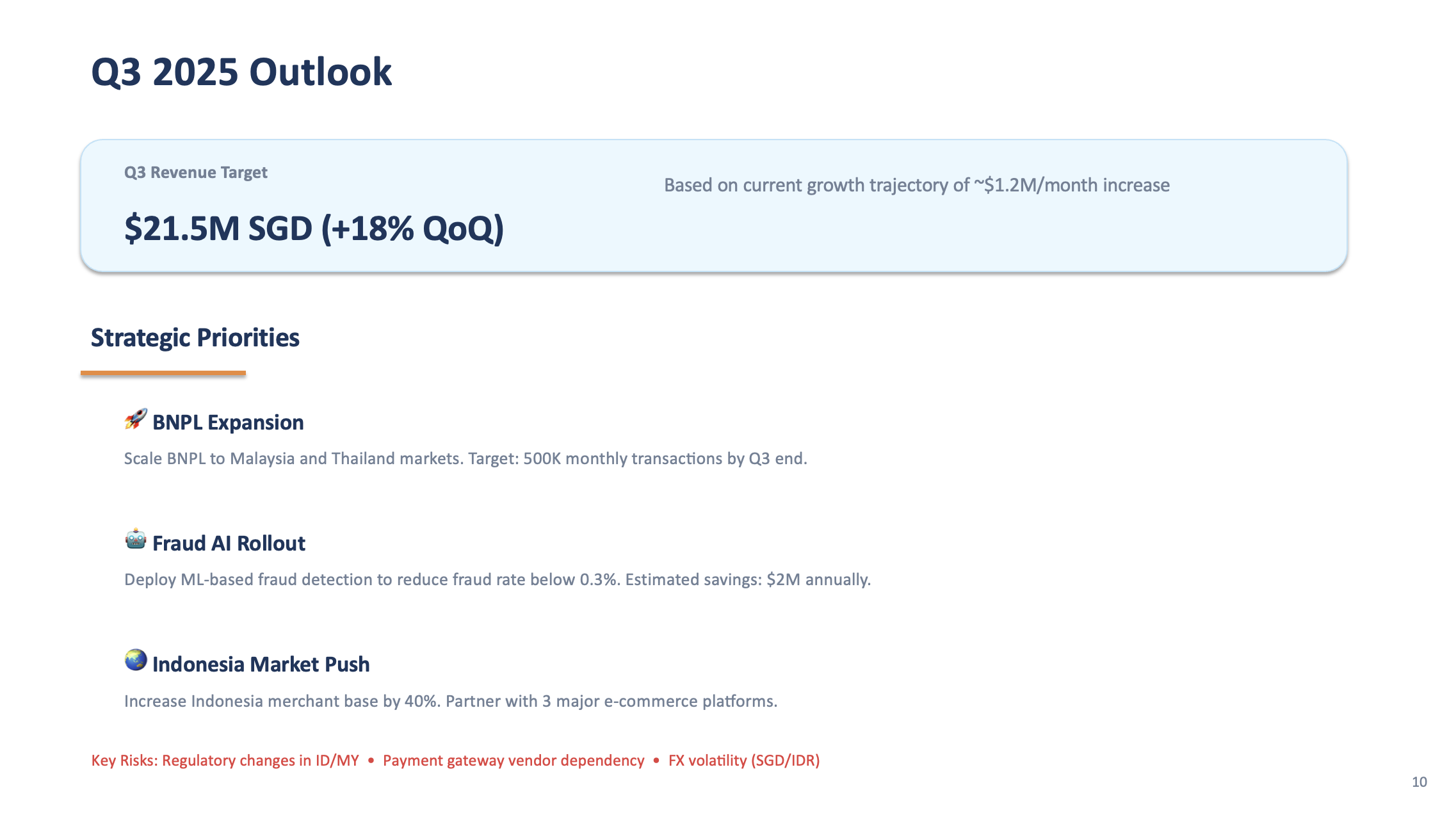
2. create_outlook_slide(df) — "Q3 2025 Outlook" slide with revenue target extrapolated from trend, 3 strategic priorities (BNPL expansion, fraud AI rollout, Indonesia market push), and key risks
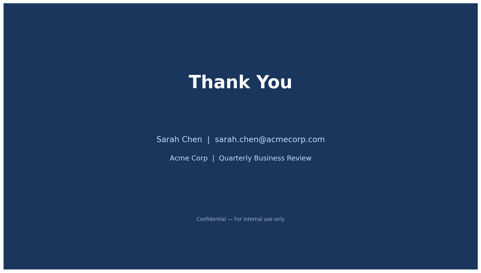
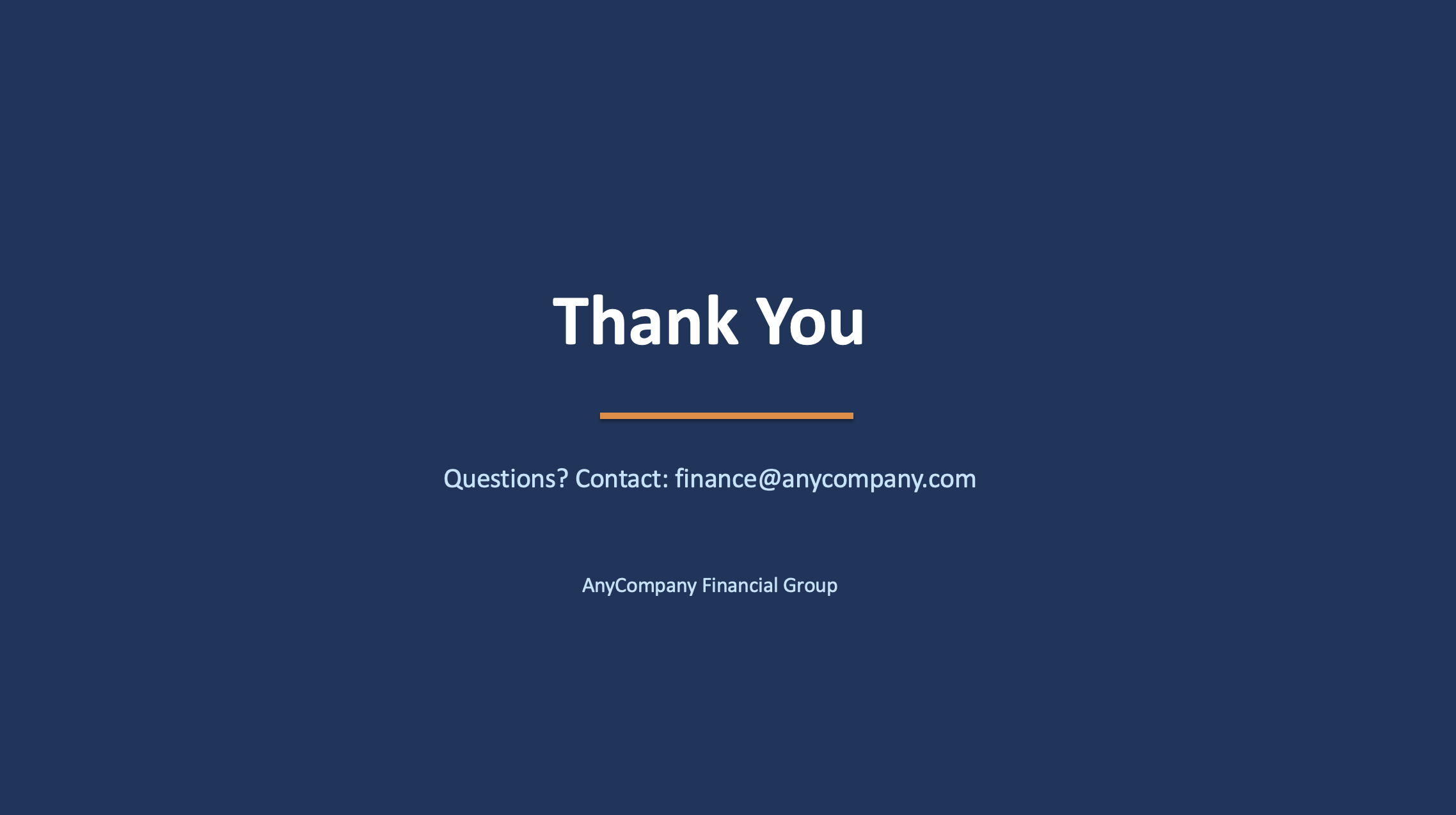
3. create_closing_slide() — Closing slide matching template_closing.png style, "Thank You" in large text, "Questions? Contact: finance@anycompany.com" below
Assemble the Full Presentation
PROMPT 3d — Assemble
Update the main block to assemble the complete presentation in this order:
1. Title slide
2. Section divider: "Executive Summary"
3. KPI Dashboard
4. Section divider: "Financial Performance"
5. Revenue chart
6. Regional breakdown chart
7. Performance analysis (two-column)
8. Section divider: "Strategic Outlook"
9. Outlook slide
10. Closing slide
Add slide numbers to the bottom-right of each content slide (except title and closing).
Save as "AnyCompany_Finance_Monthly_Review_June_2025.pptx". Run the script.
Step 4: Review & Iterate
Open the generated PPTX and review all 10 slides. If anything needs adjusting, just describe it to Kiro. Here are some common refinements:
EXAMPLE ITERATION PROMPTS — use whichever apply
Review the generated presentation and fix these issues:
- Make the chart fonts larger and more readable
- Add a subtle grid on the y-axis of the charts
- Ensure all text fits within slide boundaries (no overflow or clipping)
- The KPI cards need more spacing between them
- Add a "BNPL Growth" spotlight slide between the regional chart and performance analysis showing BNPL transaction growth as a line chart with month labels
Regenerate the presentation.
🎯 Pro tip: Screenshot and describe
If a slide doesn't look right, you can take a screenshot of the problematic slide and drag it into the Kiro chat. Then say: "This slide has overlapping text — fix the layout." Kiro can see the image and understand exactly what needs to change. This is often faster than describing the issue in words.
Preview: Final Presentation (11 Slides)
Here's what the finished presentation looks like after all steps. Use the arrows to browse through all 11 slides:
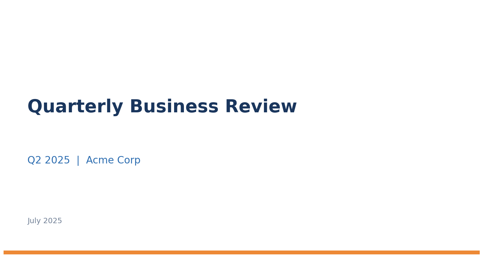
Slide 1 of 11 — Title
What You Accomplished
📸 Extracted brand style from template screenshots using Kiro's vision
📊 Generated data-driven charts with matplotlib
🏗️ Built a complete 10+ slide PPTX that matches your corporate template
🔄 Iterated on the design through natural language
The same script can be reused with new data each month — just update the CSV files and re-run. The template style stays consistent automatically.